I have decided to base my music magazine on the indie genre, because of my interest in this music. Indie stands for independent, meaning that you are independent, or so it use to in the 1980’s when indie emerged. Since the 1980’s indie as a genre has gone through a transformation, keeping only the name. Indie is now based around popular student music. The popular indie groups are all under large record labels as apposed to the 80’s independent bands that started it all off. People also see indie as a distinctive genre of rock music, and that the independent ideology has disappeared.
Indie rock artists are known for maintaining complete control of their music and careers. They release albums on independent record labels and rely on going on tour. They also rely on airplay on independent or college radio stations and, in recent years have started using the Internet for promotion. However, in the 2000's many acts with a musical style identified as "indie" signed to major record labels, and began promoting themselves through more traditional media outlets. This has led to a further confusion in the meaning of the term.


Q- another Bauer production with a readership of 113,174 just under MOJO's readership and above Kerrang and NME. Q is produced monthly like MOJO and costs £3.99 21p cheaper than MOJO i believe this is due to the different target audience. The audience is for people in their 30's and 40's. Q has around 170 to 200 pages this represents the audience it is aimed at being more intellectual.

Rock Sound- is produced by editions freeway a small french publisher. The magazine has a readership of 74,000. Rocksound costs £4.80 this shows the audience it's aimed at, i beleive the audience would be about 30 to 40's as you can see similarities in price and design comapred with Q and MOJO. Rocksound was first produced in Britain under a french label called editions freeway.

NME- stands for, New Musical Express, published weekly since March 1952. It was the first British magazine to include a singles chart. NME is produced by IPC Media and has a readership of roughly 40,000 and costs £2.20 apealing to a student audience with lower income. It was initially published in a non-glossy tabloid format on standard newsprint, but like many other papers has had to adapt to keep readership up. I would say the target audience is males in their late teens 15 to 19. NME are very sucessful considering their small audience and high readership.

 This is an NME contents page it consist of a basic but professional looking layout with the band index on the left hand side going down the page, the headings on the right and a central image above a subscription advertand intorduction. I decided to use this layout as a sort of template for my magazine. They use the red black and white colour scheme throughout which gives this page its identity, i will look to do the same using a colour scheme and layout that will give my magazine its own identity making it stand out on the shelf.
Production


These cartoons are going to go either side of the main image like in the NME cover.
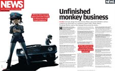
For my two page spread i have changed around the NME version with a diffrent cartoon but decided to keep the background image changing it to a different car with four headlights a bit like a mustang.

You can see some similarities but overall this is a different piece of artwork and will fit in well with the layout of the NME i am basing my magazine on.
 This here is the original NME two page spread with its red white and black colour scheme as used by NME throughout there magazine i will do the same with mine, i think the NME colour scheme looks professional and is not as cluttered as most of the other competitors.
I then had to put my drawings into photoshop and add colour to create a professional look. I opened them in photoshop and intensified the lines tidying up smudges etc, i then created another layer calling it colour and used the magic tool to select certain parts of the drawing i then filled it with colours creating swatches as i went. The magic tool did not fill the entire drawing and missed small bits out so i had to go other these bits with the brush tool, the finished cartoon where very professional looking and look the part.


My next task was to create a background as you can see from the magazine im basing my magazine on, it has a strange mixture of colours on a textured background. To create my background i went outside and photographed a piece of tarmac from the carpark.

I then put it into photoshop and started playing around with the efffects. I invered the colours and got a large brush with little bits of colour on it and went over the work i then changed the colour to red and put another layer of colour over this.

This created my background i then arranged it towards the back of my magazine.
I used the shape tool choosing a polygon to create my triangle i clicked on the poligon and edited the number of sides or depth of the edges until i got a perfect star i coloured it red adjusted the sizing and copy and pasted it five times.

For my masthead (IMT) i typed in IMT and changed the font to gill sans bold, as this was the closest match to the NME font i then added two affects i added the stroke affect colouring it white and playing around with the depth noise etc until it was perfect, i then added outer glow making it black and adjusted it until it was right, this created the NME style on my IMT masthead.

.....................................................................................................................................................................
I used a stills camera to take a picture of someone i knew in a pose that would fit in with my front page i took roughly 25 photos and found one i liked, this is it.

I then opened it in photoshop and used the pen tool to cut it out after this i created the picture its own layer without a background. I then placed it into in design and moved it around so it was in the perfect position.

My front page was now finished with a main image, two cartoons either side and the basic NME styled layout.
Finished product


NME- stands for, New Musical Express, published weekly since March 1952. It was the first British magazine to include a singles chart. NME is produced by IPC Media and has a readership of roughly 40,000 and costs £2.20 apealing to a student audience with lower income. It was initially published in a non-glossy tabloid format on standard newsprint, but like many other papers has had to adapt to keep readership up. I would say the target audience is males in their late teens 15 to 19. NME are very sucessful considering their small audience and high readership.

Q magazines contents page shows alot less clutter and a simpler layout this to me says that it has a higher reading age in its target audience, seeking out a maturer audience, overall its very simple and abit like NME just with the headings on the left and no band index, i could decide to go with this layout but i have decided that this kind of mature layout will be all wrong for my target audience, so somehting abit more cluttered is what i need, but not too cluttered. Q is one of the maturist magazines i have looked at where as rocksound seems to have the youngest audience showing alot of clutter and bright colours, this would be down to the social class of the target audiences, this is reflected in the price as mentioned earlier.

Production
I have decided to base my music magazine front cover on a gorrilaz cover featured in NME

This means i had to have cartoons of the band as well as photographs, i decided to draw my own cartoons in the gorrilaz style and scan them in; adding colour afterwards on the mac, i have been experimenting with different cartoons and have finally decided on two cartoons for the front page and one for the two page spread.


These cartoons are going to go either side of the main image like in the NME cover.
For my two page spread i have changed around the NME version with a diffrent cartoon but decided to keep the background image changing it to a different car with four headlights a bit like a mustang.

You can see some similarities but overall this is a different piece of artwork and will fit in well with the layout of the NME i am basing my magazine on.
I then had to put my drawings into photoshop and add colour to create a professional look. I opened them in photoshop and intensified the lines tidying up smudges etc, i then created another layer calling it colour and used the magic tool to select certain parts of the drawing i then filled it with colours creating swatches as i went. The magic tool did not fill the entire drawing and missed small bits out so i had to go other these bits with the brush tool, the finished cartoon where very professional looking and look the part.


My next task was to create a background as you can see from the magazine im basing my magazine on, it has a strange mixture of colours on a textured background. To create my background i went outside and photographed a piece of tarmac from the carpark.

I then put it into photoshop and started playing around with the efffects. I invered the colours and got a large brush with little bits of colour on it and went over the work i then changed the colour to red and put another layer of colour over this.

This created my background i then arranged it towards the back of my magazine.
I used the shape tool choosing a polygon to create my triangle i clicked on the poligon and edited the number of sides or depth of the edges until i got a perfect star i coloured it red adjusted the sizing and copy and pasted it five times.
For my masthead (IMT) i typed in IMT and changed the font to gill sans bold, as this was the closest match to the NME font i then added two affects i added the stroke affect colouring it white and playing around with the depth noise etc until it was perfect, i then added outer glow making it black and adjusted it until it was right, this created the NME style on my IMT masthead.

.....................................................................................................................................................................
I used a stills camera to take a picture of someone i knew in a pose that would fit in with my front page i took roughly 25 photos and found one i liked, this is it.

I then opened it in photoshop and used the pen tool to cut it out after this i created the picture its own layer without a background. I then placed it into in design and moved it around so it was in the perfect position.

My front page was now finished with a main image, two cartoons either side and the basic NME styled layout.
Finished product

My front cover came out reasonably good, looking suprisingly professional, all of the individual pieces of my front cover from the masthead to the cartoons and main image fitted together very well.

My contents page was based around NME contents page layout but i used my understanding of basic elements within this layout to adapt it for my magazine so that i liked the finished product this meant shortening text boxes and enlarging images.

My two page spread is simple but affective in comparison to NME's two page spread i actualy prefer mine due to the text wrap around the picture, creating one flowing image text combination in which works very well.

I have used alot of technology in the production of this magazine and am very happy with my final piece there are small things i would change that would make it abit quicker and easier to do in future, but overall i think i have done it reasonably well with the vast amount of technology in which i had to learn and use effectively. Take note this is the un edited version, the two page spread complete is on te evaluation page.
No comments:
Post a Comment